A mobile-friendly website is essential for good SEO and better rankings on Google. With over half of all global web traffic coming from mobile devices, ensuring your website is optimized for mobile is more important than ever. Google’s Mobile-Friendly Test is a key tool to help you evaluate whether your site meets mobile optimization standards.
- What is the Google Mobile-Friendly Test?
- How to Use the Fyptt Website Mobile View Checker
- Google Mobile-Friendly Updates: Key Milestones in Mobile Optimization
- Google’s Mobile Optimization Changes and Requirements
- Why Mobile-Friendliness Is Crucial for SEO
- Key Mobile-Friendly Test Issues to Watch For
- How to Use the Google Mobile-Friendly Test: Step-by-Step Guide
- Tips for Improving Mobile-Friendliness and SEO Rankings
- 1. Embrace Responsive Web Design
- 2. Optimize for Speed
- 3. Simplify Mobile Navigation
- 4. Regularly Test Your Site’s Mobile Performance
- FAQs About Google Mobile-Friendly Test
- Conclusion
But before diving into the intricacies of the test, if you want to check how your website appears on mobile, the Fyptt Website Mobile View Checker is a great tool to get an instant preview of your website’s mobile responsiveness.
Whether you’re a beginner or an expert SEO professional, this comprehensive guide will explain everything you need to know about the Google Mobile-Friendly Test, why it’s essential for SEO, and how to implement changes to improve your mobile rankings.
What is the Google Mobile-Friendly Test?
The Google Mobile-Friendly Test is a free tool offered by Google that evaluates how well your website performs on mobile devices. It checks whether your web pages are optimized for mobile users by assessing factors such as page load speed, text size, and whether elements are easy to interact with on smaller screens.
How the Google Mobile-Friendly Test Works
The tool analyzes your webpage’s design, content, and overall functionality when viewed on a mobile device. Here’s how it works:
- URL Submission: Simply input the URL of your webpage into the tool.
- Analysis: The tool runs an analysis and identifies issues that could affect the mobile user experience.
- Results: Once the test is complete, you’ll receive a report detailing whether your site is mobile-friendly and the necessary steps to fix any issues.
This process helps you understand if your website is ready for the mobile-first world and ensures that it meets Google’s ranking criteria for mobile devices.
How to Use the Fyptt Website Mobile View Checker
Before you jump into the Google Mobile-Friendly Test, you can use the Fyptt Website Mobile View Checker to get an immediate preview of your website on mobile. This tool helps you assess how your site looks and functions on different mobile devices and screen sizes. Here’s how to use it:
- Visit the Fyptt Website Mobile View Checker: Go to Fyptt
- Enter Your Website URL: Input the URL of the page you want to test.
- View Mobile Version: Click the button to view how your site appears on mobile devices. You’ll see how your content adjusts to different screen sizes and whether any elements look out of place.
- Analyze and Make Improvements: The preview helps you identify if your text is too small, if buttons are too close together, or if your content is cut off on smaller screens. You can take note of any issues before running the Google Mobile-Friendly Test.
Benefits of Using Fyptt Website Mobile View Checker
The Fyptt Website Mobile View Checker is a valuable tool for several reasons:
- Quick Preview: It gives you a fast, visual representation of your website’s mobile version, helping you identify problems immediately.
- Device-Specific Views: It shows how your website looks on different mobile devices and screen sizes, ensuring a more comprehensive review of your mobile responsiveness.
- No Technical Setup: Unlike some other tools, Fyptt doesn’t require you to be a developer or have technical expertise. It’s a user-friendly tool designed for anyone to use.
- Helps Improve User Experience: By using the tool regularly, you can ensure your mobile users always have a seamless and pleasant browsing experience.
By using the Fyptt Website Mobile View Checker, you can gain valuable insights into your mobile design before diving deeper into the more technical aspects of mobile optimization with Google’s Mobile-Friendly Test.
Google Mobile-Friendly Updates: Key Milestones in Mobile Optimization
Over the years, Google has introduced several updates that focus on mobile optimization, underscoring the importance of mobile-friendly websites. These updates have directly impacted how websites are ranked and indexed, emphasizing the need for responsive and mobile-optimized designs. Here’s a breakdown of major updates related to mobile-friendly ranking factors.
| Update | Description | Impact on Websites |
| Mobile-Friendly Update (April 21, 2015) | Google officially announced that mobile-friendliness would be a ranking factor in mobile search. | Websites that weren’t optimized for mobile devices saw a drop in mobile search rankings. |
| Mobile-First Indexing (March 2018) | Google began using the mobile version of websites for indexing and ranking, rather than the desktop version. | Mobile-optimized websites gained an SEO advantage, while non-mobile-friendly sites faced penalties. |
| Mobile-First Indexing Rollout (March 2020) | Full rollout of mobile-first indexing, meaning all websites were indexed with the mobile version as the primary source. | Websites needed to ensure their mobile version contained all content that was available on the desktop version. |
| Core Web Vitals Update (June 2021) | Google introduced user experience signals, including loading performance (LCP), interactivity (FID), and visual stability (CLS) as ranking factors. | Mobile sites needed to pass Core Web Vitals to maintain or improve rankings, especially on mobile searches. |
| Page Experience Update (August 2021) | The Page Experience update integrated Core Web Vitals as part of the page experience ranking signal for mobile and desktop searches. | Mobile-friendly websites with fast load times, smooth interactivity, and stability saw rankings improve. |
Google’s Mobile Optimization Changes and Requirements
This table highlights the specific technical changes and mobile optimization requirements Google introduced over time to improve mobile user experience and performance.
| Change/Requirement | Description | Impact on SEO |
| Mobile-Friendly Test Tool Updates (2020) | Google updated its Mobile-Friendly Test tool to provide more accurate and comprehensive reports. | Webmasters can now test mobile usability with more precision and get detailed feedback on how to improve mobile sites. |
| Mobile User-First Approach (2021) | Google refined its search algorithms to prioritize user experience on mobile, specifically for mobile-first websites. | Websites offering a smooth and fast mobile experience received better rankings, while sites with poor mobile UX dropped in rankings. |
| Progressive Web Apps (PWA) Indexing Support (2020) | Google started officially supporting Progressive Web Apps in mobile search results. | PWAs are now considered mobile-friendly and can rank in search results like traditional mobile-optimized websites. |
| AMP (Accelerated Mobile Pages) Deprecation (2021) | Google de-prioritized AMP in mobile search, focusing instead on user experience and mobile optimization overall. | Websites that had relied heavily on AMP for speed now needed to focus more on native mobile optimizations and page performance. |
| Mobile-Friendly Speed Requirements (2022) | Mobile site speed became a critical ranking factor alongside mobile-friendliness in Core Web Vitals. | Sites with slow mobile load times faced ranking drops, and fast-loading mobile sites gained a significant advantage. |
Why Mobile-Friendliness Is Crucial for SEO
Mobile-First Indexing: Google’s New Standard
Google has adopted mobile-first indexing, meaning it now primarily uses the mobile version of your website for ranking and indexing. If your website isn’t mobile-friendly, it could hurt your rankings in search results. This change reflects the shift in how people browse the web, with over 50% of all global web traffic now coming from mobile devices.
User Experience and Bounce Rate
A mobile-friendly website enhances the user experience (UX), which is critical for SEO. If your website loads slowly or is difficult to navigate on a mobile device, visitors are more likely to bounce. A high bounce rate can signal to Google that your website is not providing a positive user experience, leading to lower rankings.
Mobile Rankings
Websites that pass the Google Mobile-Friendly Test have a higher chance of ranking well in search results, especially when users are searching via mobile. This makes mobile optimization an essential part of your SEO strategy.
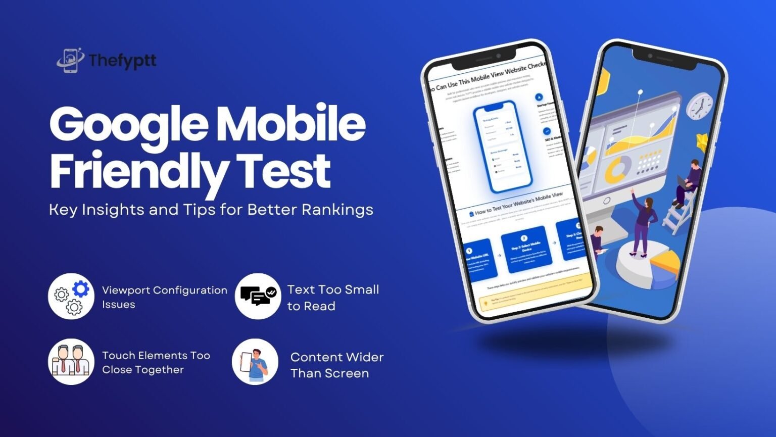
Key Mobile-Friendly Test Issues to Watch For
The Google Mobile-Friendly Test identifies several common issues that can impact your website’s mobile performance. Understanding these issues will help you improve your site’s mobile-friendliness.
| Issue | Description | How to Fix It |
| 1. Viewport Configuration Issues | The viewport controls how your web page is scaled on different devices. If your website doesn’t have a properly configured viewport, it can cause issues like small or improperly scaled content. | – Ensure your site has a responsive design that adapts to various screen sizes.- Use <meta name=”viewport” content=”width=device-width, initial-scale=1″> to adjust the page’s width based on the device’s screen size. |
| 2. Text Too Small to Read | Small text on mobile websites makes it hard for users to read, especially on smaller screens, leading to a poor experience. | – Use larger fonts (at least 16px for body text).- Adjust line height and spacing for better legibility. |
| 3. Touch Elements Too Close Together | Mobile users interact with touch, so buttons and links need to be large enough to tap without accidental clicks. | – Increase the size of buttons and links to at least 48x48px.- Ensure sufficient space between clickable elements. |
| 4. Content Wider Than Screen | If a website isn’t responsive, content may overflow the screen, requiring horizontal scrolling, which can make navigation on mobile devices difficult. | – Ensure images, videos, and text are contained within the viewport.- Use responsive design principles such as fluid grids and flexible images. |
| 5. Slow Mobile Load Times | Slow-loading websites can lead to poor user experiences, increased bounce rates, and negative SEO rankings. | – Compress images and optimize them for mobile.- Minimize JavaScript and CSS files.- Use a content delivery network (CDN) to reduce server response times. |
How to Use the Google Mobile-Friendly Test: Step-by-Step Guide
Using the Google Mobile-Friendly Test tool is simple. Here’s a step-by-step guide:
- Visit the Mobile-Friendly Test Page: Go to the Google Mobile-Friendly Test page.
- Enter Your URL: In the text box, enter the URL of the webpage you want to test.
- Click on “Test URL”: After entering the URL, click the “Test URL” button.
- Review the Results: Once the test is complete, you’ll see a message indicating whether your site is mobile-friendly. If it’s not, Google will provide a detailed report on what needs to be fixed.
Tips for Improving Mobile-Friendliness and SEO Rankings
Improving your mobile website isn’t just about passing the test it’s about creating a seamless mobile experience for your users. Here are some additional tips:
1. Embrace Responsive Web Design
Responsive design ensures that your website adapts to different screen sizes, from desktop to mobile. This approach is recommended by Google and is crucial for both mobile optimization and SEO.
Key considerations:
- Use media queries to adjust the layout based on device width.
- Ensure all content (text, images, and videos) is optimized for mobile viewing.
2. Optimize for Speed
Mobile users expect fast-loading websites. A slow website can lead to higher bounce rates and lower rankings. Use tools like Google PageSpeed Insights to identify performance issues and implement fixes.
Speed optimization tips:
- Compress and properly size images.
- Minimize CSS, JavaScript, and HTML files.
- Enable browser caching and use a content delivery network (CDN).
3. Simplify Mobile Navigation
Mobile users have limited screen space, so it’s essential to make navigation simple and intuitive. Use a clean, minimalist design for menus and ensure easy access to key sections of your website.
Navigation tips:
- Use a sticky header for easy access to navigation on long pages.
- Implement a mobile-friendly dropdown or hamburger menu.
4. Regularly Test Your Site’s Mobile Performance
Mobile optimization is an ongoing process. Regularly test your website using the Google Mobile-Friendly Test to ensure it continues to perform well across devices.
Bonus Tip: Keep an eye on Google Search Console for mobile usability errors. This tool will notify you of any issues that affect your site’s mobile performance.
FAQs About Google Mobile-Friendly Test
1. What is the Google Mobile-Friendly Test?
The Google Mobile-Friendly Test is a free tool that helps you check if your website is optimized for mobile devices. It analyzes various aspects of your site and provides recommendations for improvement.
2. How often should I test my website’s mobile-friendliness?
It’s a good idea to test your website regularly especially after making updates or redesigns to ensure it’s always mobile-friendly.
3. Can a mobile-friendly website improve my SEO?
Yes, a mobile-friendly website can significantly improve your SEO by providing a better user experience, reducing bounce rates, and helping you rank higher in Google’s mobile-first search index.
4. What are the most common mobile usability issues?
Common issues include small text size, touch elements too close together, content wider than the screen, and slow loading times.
Conclusion
Ensuring that your website passes the Google Mobile-Friendly Test is crucial for maintaining a strong SEO strategy in today’s mobile-first world. By focusing on mobile optimization, you not only improve your user experience but also increase your chances of ranking higher on Google’s search results. Start by using the Google Mobile-Friendly Test to identify areas for improvement, implement the tips provided in this article, and monitor your mobile performance regularly. This way, you’ll stay ahead of the competition and offer a seamless experience to your users.


