Ensuring that your website functions seamlessly across devices is a non-negotiable requirement. Think about it, when was the last time you tried to access a site on your mobile device only to be frustrated by broken links, slow loading times, or unresponsive designs? I’ve been there too, and it’s not only annoying but can be damaging to your brand.
- Why Mobile Site Viewers Are Essential for Your Website
- The Top Mobile Site Viewer Tools Every Website Owner Should Know About
- 1. Google Mobile-Friendly Test
- 2. BrowserStack
- 3. Responsinator
- 4. CrossBrowserTesting by SmartBear
- 5. Adobe XD (with Mobile Preview)
- 6. Fyptt Website Mobile View Checker
- How to Choose the Right Mobile Site Viewer Tool for Your Needs
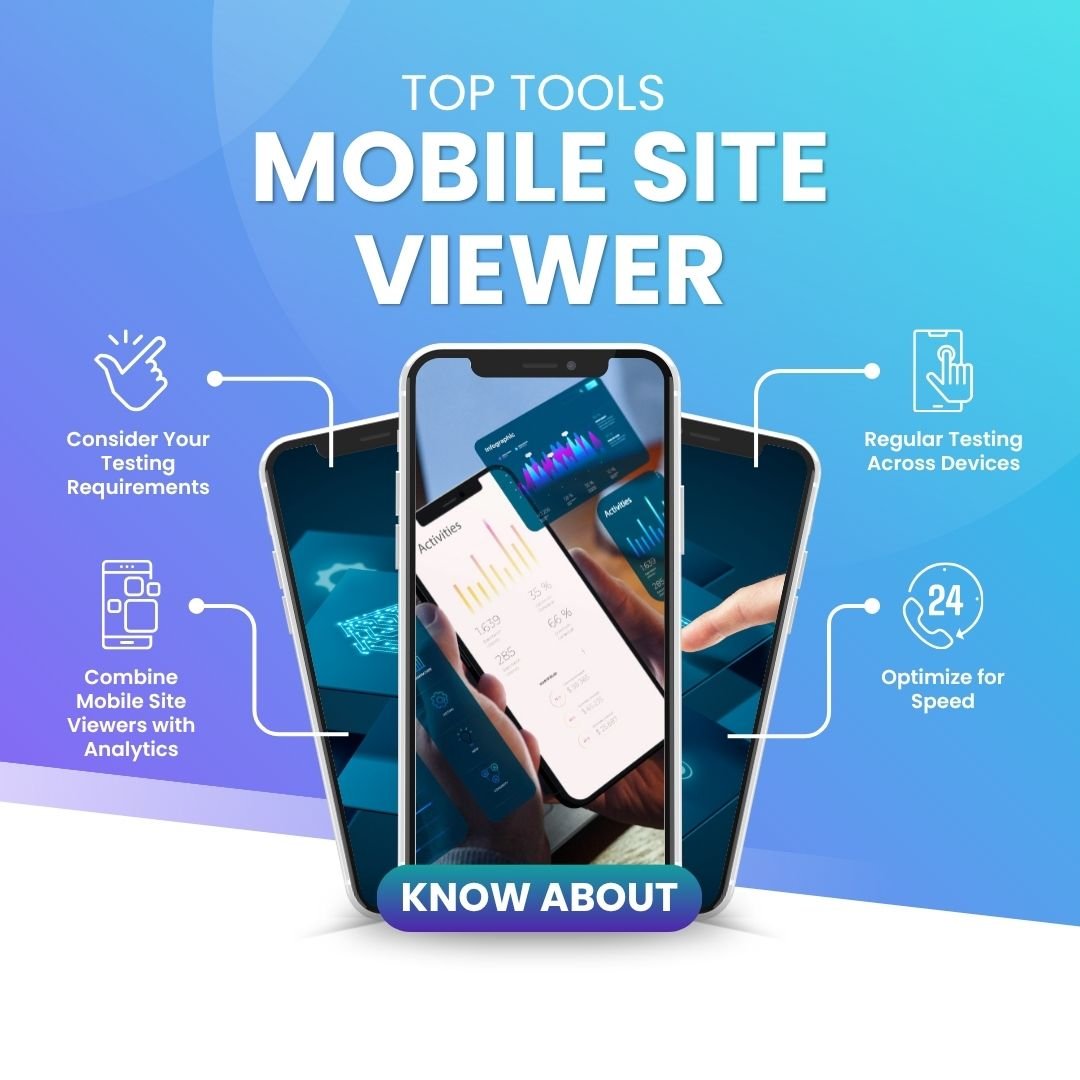
- Consider Your Testing Requirements
- Budget-Friendly vs. Advanced Features
- Integrating Tools into Your Workflow
- Best Practices for Mobile Site Optimization Using These Tools
- Conclusion
If you’re a website owner or manager, it’s time to consider how your site looks and performs on mobile devices. With over half of internet traffic coming from mobile users, you simply can’t afford to neglect this area. That’s where mobile site viewer tools come in. These tools help you see your website exactly as mobile visitors experience it, allowing you to make necessary adjustments to optimize your site’s design, speed, and overall user experience.
In this article, I’m going to take you on a journey through some of the best mobile site viewer tools every website owner should know about. We’ll explore why they’re essential for your site, dive into the top tools available, and I’ll share actionable tips on how to use them effectively to boost your site’s performance and mobile experience. Let’s jump in!
Why Mobile Site Viewers Are Essential for Your Website
The Importance of Mobile Optimization
Mobile optimization is no longer just a nice-to-have feature for your website. It’s a must. You’ve probably already heard that over half of all internet browsing happens on mobile devices, but here’s something more important to consider: Google, the search engine giant, prioritizes mobile-first indexing. This means that Google evaluates and ranks your site based on how well it performs on mobile devices. So, if your site isn’t mobile-optimized, it’s likely falling behind in search rankings.
Now, think about this: when your site isn’t mobile-friendly, you risk losing customers and visitors who might otherwise engage with your content, shop on your e-commerce site, or contact you for services. It’s not just about functionality either mobile optimization directly impacts user experience (UX) and, ultimately, your conversion rates.
This is where mobile site viewers step in. They allow you to see how your site appears and functions on different mobile devices. These tools simulate mobile devices, so you can experience your website as your users do. You can check for broken links, improper image sizes, and other design flaws that affect performance. Once you see the issue, you can fix it. Simple as that.
What is a Mobile Site Viewer Tool?
A mobile site viewer tool is exactly what it sounds like it’s a tool that simulates how your website will appear on mobile devices. Think of it as a digital mirror that reflects how your site will look to visitors browsing on smartphones or tablets. These tools help you evaluate various factors such as load speed, image scaling, navigation, and usability elements that significantly impact mobile user experience.
But here’s the thing: mobile site viewers are more than just for checking visual elements. They provide insights into mobile responsiveness, speed performance, and the overall interaction users will have with your website on different mobile screens. By using a mobile site viewer, you gain the power to tweak and optimize your site in real-time, making it a crucial tool in your website management toolkit.
The Top Mobile Site Viewer Tools Every Website Owner Should Know About
1. Google Mobile-Friendly Test
When it comes to testing mobile compatibility, Google Mobile-Friendly Test is one of the first tools I recommend. It’s simple, free, and directly tied to Google’s search algorithms.
| Category | Details |
| Key Features | Mobile Usability Check: Google assesses whether your site is mobile-friendly or not. |
| Page Speed Insights: In addition to usability, it also provides performance insights to help optimize your site’s load speed. | |
| Instant Results: You’ll get a quick snapshot of whether your site is mobile-friendly, along with recommendations on how to improve. | |
| Pros | Completely Free: It’s Google, so the tool is free to use. |
| Actionable Insights: The report includes easy-to-understand suggestions for improvement. | |
| Cons | Limited Testing: While useful, the tool only provides a basic mobile usability check without delving deep into detailed features like device simulation. |
2. BrowserStack
If you want a more in-depth testing tool with real-world device testing, BrowserStack is an excellent choice. With BrowserStack, you can test your website on real devices, ensuring that the experience is as authentic as possible.
| Category | Details |
| Key Features | Real Device Testing: Access real devices across multiple platforms (iOS, Android) and screen sizes. |
| Cross-Browser Testing: It allows you to test your website’s appearance and functionality across a variety of browsers. | |
| Automated Testing: The tool can be used to automate your testing for different devices, making the process much quicker. | |
| Pros | Extensive Device Library: BrowserStack allows you to test your website on a wide range of real devices. |
| Easy Integration: It integrates with continuous integration and continuous deployment pipelines, making it ideal for teams. | |
| Cons | Pricey for Small Businesses: While powerful, it comes with a cost. It’s on the pricier side for small businesses and freelancers. |
3. Responsinator
Sometimes you don’t need a complex tool—just a quick check to see how your website looks on different mobile devices. This is where Responsinator comes in handy.
| Category | Details |
| Key Features | Device Preview: See how your website appears on popular devices like iPhone, iPad, and Android phones. |
| Simple Interface: It’s easy to use, making it perfect for website owners who just need a fast overview of their site’s mobile compatibility. | |
| Pros | Free & Simple: Responsinator is a free tool that requires no sign-up or technical knowledge. |
| Quick & Easy: It’s a great tool for getting a quick visual snapshot of your site on different devices. | |
| Cons | Limited Features: While it’s useful for a quick visual check, it doesn’t provide the depth of analysis that tools like BrowserStack or CrossBrowserTesting do. |
4. CrossBrowserTesting by SmartBear
CrossBrowserTesting is a powerful tool for both mobile and browser testing. If you’re serious about ensuring your site works perfectly across multiple mobile devices and browsers, this tool is a game-changer.
| Category | Details |
| Key Features | Cross-Browser Testing: Test your site across multiple browsers, including Chrome, Safari, and Firefox. |
| Real Device Testing: Like BrowserStack, CrossBrowserTesting gives you access to a variety of real mobile devices for accurate testing. | |
| Visual and Functional Testing: It checks both the visual layout and functionality of your mobile site. | |
| Pros | Comprehensive Testing: Ideal for testing both design and functionality on real devices. |
| Screenshots and Video Recording: It allows you to capture screenshots and record videos of mobile sessions for in-depth analysis. | |
| Cons | Cost: It’s a paid service, and while it’s highly effective, it may be out of reach for small businesses or those on a budget. |
5. Adobe XD (with Mobile Preview)
For website designers looking to test mobile layouts during the design phase, Adobe XD is a great option. This tool offers not only design capabilities but also mobile preview features that allow you to simulate your website’s mobile version.
| Category | Details |
| Key Features | Design and Prototype: Adobe XD allows you to create designs and interactive prototypes directly within the tool. |
| Mobile Preview Mode: You can preview how your designs will look and function on mobile devices before making them live. |
| Integration with Adobe Suite: If you’re already using other Adobe products, Adobe XD integrates seamlessly with them. |
| Pros | Great for Designers: It’s an excellent choice for designers creating responsive websites. |
| Interactive Testing: You can test user interactions, such as touch gestures, to refine your design. |
| Cons | Not for Developers: Adobe XD is more suited for design rather than in-depth performance testing. |
6. Fyptt Website Mobile View Checker
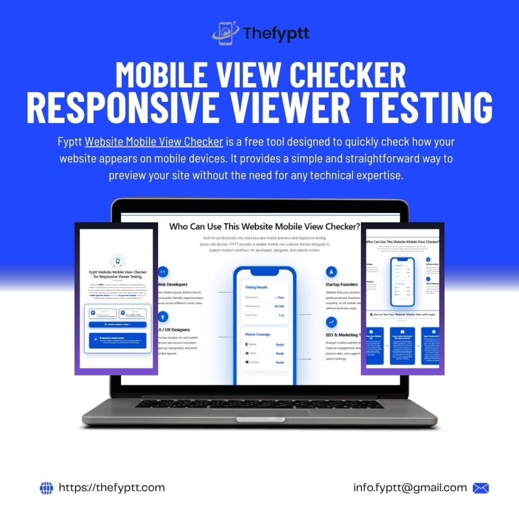
Fyptt Website Mobile View Checker is a free tool designed to quickly check how your website appears on mobile devices. It provides a simple and straightforward way to preview your site without the need for any technical expertise.
| Category | Details |
| Key Features | Instant Mobile View Check: View your site on a variety of devices, including phones and tablets, with just a few clicks. |
| Simple Interface: The tool’s easy-to-use interface allows anyone to quickly test how their site performs on mobile without any hassle. | |
| Free to Use: Fyptt Website Mobile View Checker is a completely free tool, making it accessible for website owners on a budget. | |
| Pros | Free and Simple: Fyptt offers a simple way to test your mobile site without any cost. |
| Quick Results: The tool provides instant results, allowing you to make necessary adjustments quickly. | |
| Cons | Limited Functionality: While it’s useful for a quick preview, Fyptt lacks advanced features like performance testing or cross-browser compatibility checks. |
How to Choose the Right Mobile Site Viewer Tool for Your Needs
Consider Your Testing Requirements
When choosing a mobile site viewer, think about what you need to test. Are you more concerned with design elements, functionality, or performance? If you’re focused on performance, Google’s Mobile-Friendly Test and Pingdom are great tools to help you identify any mobile speed issues. For in-depth cross-device and browser testing, BrowserStack or CrossBrowserTesting would be better options.
Budget-Friendly vs. Advanced Features
If you’re on a tight budget, you might start with a free tool like Responsinator, but for more detailed testing, you may want to consider investing in a paid tool like BrowserStack or CrossBrowserTesting. These tools provide more advanced features like real device testing, cross-browser compatibility checks, and more detailed analytics.
Integrating Tools into Your Workflow
Another factor to consider is how well the mobile site viewer integrates with your current workflow. If you’re using tools like Google Analytics, check if the mobile testing tool can provide insights that integrate with your analytics data. Tools like Adobe XD integrate well into a design workflow, making it a great choice for designers.
Best Practices for Mobile Site Optimization Using These Tools
Regular Testing Across Devices
Regularly testing your website on different devices is crucial. This helps you stay on top of any issues that could negatively impact the user experience. Testing should be part of your routine, especially after updates or redesigns.
Combine Mobile Site Viewers with Analytics
Pairing mobile site viewers with analytics tools like Google Analytics helps you track real-time user behavior. By monitoring how users interact with your mobile site, you can make informed decisions about which aspects of your site need improvement.
Optimize for Speed
Mobile users expect fast-loading websites. If your mobile site takes too long to load, you risk losing visitors. Use tools like Pingdom or Google’s Mobile-Friendly Test to identify speed issues and improve performance.
Conclusion
As mobile browsing continues to dominate the internet, optimizing your website for mobile users is no longer optional. Mobile site viewers are invaluable tools that help you ensure your website is functioning smoothly on mobile devices. By using these tools regularly, you can improve mobile performance, enhance user experience, and ensure your site ranks well on search engines.


