
In today’s mobile-first world, offering an outstanding mobile website experience isn’t just a luxury it’s a necessity. According to recent studies, over 50% of global web traffic comes from mobile devices, and this trend continues to grow. As a small business owner, you can’t afford to overlook the mobile experience your website provides. Slow load times, poor navigation, and unoptimized images can drive potential customers away, costing you valuable sales.
- Why Mobile User Experience Matters for Small Businesses
- Common Mobile User Experience Pitfalls
- What Fyptt Brings to the Table for Mobile Testing
- Step-by-Step Guide to Using Fyptt for Mobile Testing
- Step 1: Accessing Fyptt’s Mobile Testing Tool
- Step 2: Running Tests on Different Devices
- Step 3: Analyzing the Results
- Step 4: Implementing Improvements
- Best Practices for Optimizing Mobile User Experience
- How Fyptt Can Save You Time and Money
- Real-Life Success Stories
- Case Study 1: Boosting Conversions for an E-Commerce Store
- Case Study 2: Enhancing User Engagement for a Local Business
- Conclusion: Ready to Optimize Your Mobile Site?
But here’s the good news: optimizing your mobile site is easier than you think, especially with the right tools. Enter Fyptt, an advanced mobile view website checker designed to ensure your site is mobile-responsive across all devices. In this article, we’ll explore how Fyptt can help you enhance your website’s mobile user experience, boost customer satisfaction, and drive more conversions. Let’s dive in!
Why Mobile User Experience Matters for Small Businesses
Before we dive into the specifics of Fyptt, let’s first understand why mobile user experience (UX) is so critical for small businesses today.
The Shift to Mobile-First
The mobile-first era is here. Mobile traffic has surpassed desktop traffic, and it’s not just a passing trend. Users are increasingly browsing, shopping, and making decisions via smartphones and tablets. If your website isn’t optimized for mobile, you’re missing out on a significant portion of your potential audience.
The Impact on Conversion Rates
A mobile-optimized website directly influences your conversion rates. According to Google, 53% of mobile users will abandon a site that takes longer than 3 seconds to load. If your website isn’t mobile-friendly, you risk losing sales and customers. Fyptt helps you pinpoint and fix mobile-specific issues before they affect your business.
User Expectations
Modern mobile users have high expectations. They want fast, easy-to-navigate sites that load quickly and are easy to read. If your website doesn’t meet these expectations, visitors will bounce. They may even share their frustrations with others, harming your reputation. This is where Fyptt can help by giving you the tools to optimize your mobile site effectively.
Common Mobile User Experience Pitfalls
To improve your mobile user experience, it’s crucial to first identify common issues that could be hurting your site’s mobile performance. Let’s take a look at some of these common mobile UX pitfalls:
Slow Load Times
Mobile users expect fast-loading websites. If your site takes too long to load, users will quickly leave. A slow mobile website not only frustrates visitors but also impacts your search engine ranking. Mobile optimization tools like Fyptt help you test load times and make adjustments to improve performance.
Difficult Navigation
Navigation is key to a good user experience. On mobile devices, a cluttered or overly complex menu can confuse users. Simple, intuitive navigation is essential to keeping users engaged. With Fyptt, you can test how your navigation functions on various screen sizes and devices, ensuring that users can find what they need quickly and easily.
Text and Image Scaling Issues
On mobile devices, readability is paramount. If your text is too small or your images are distorted, users will have a hard time engaging with your content. Fyptt helps you assess how your text and images appear on different mobile devices and suggests ways to improve them.
Broken Links and Buttons
Broken links and buttons that don’t work are a major turn-off for users. If users encounter non-functional links or buttons on your mobile site, they’ll likely leave in frustration. Fyptt provides a detailed analysis of these issues, ensuring that your site is fully functional on all devices.
What Fyptt Brings to the Table for Mobile Testing
Now that we’ve covered the common mobile UX issues, let’s explore how Fyptt can help you address them and improve your site’s mobile performance.
Overview of Fyptt’s Key Features
Fyptt is a comprehensive mobile view website checker that helps you test and optimize your site’s mobile responsiveness. Here’s an overview of what Fyptt offers:
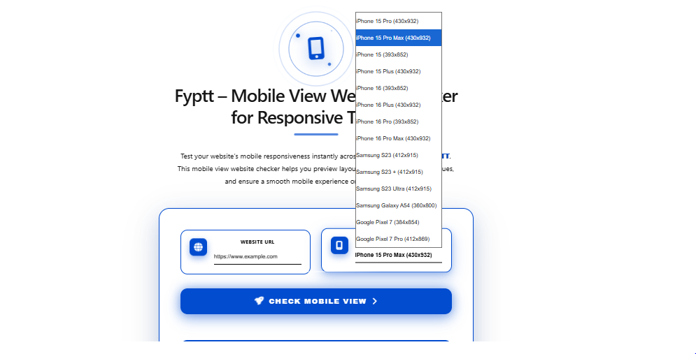
- Mobile View Testing: Fyptt allows you to view your website as it appears on a variety of mobile devices. You can check how your site looks on different screen sizes, operating systems, and browsers.
- Instant Feedback: Fyptt provides real-time feedback on issues that could be affecting your site’s mobile performance. It highlights potential problems, such as slow load times, navigation issues, and broken links.
- Actionable Suggestions: Fyptt doesn’t just point out issues it also offers actionable suggestions for improvements. Whether it’s optimizing images, adjusting text sizes, or simplifying navigation, Fyptt helps you make the necessary changes.
- Multi-Device Compatibility: Fyptt tests your website on various devices, including smartphones, tablets, and even foldable devices, to ensure that it looks great and functions well across all platforms.
Step-by-Step Guide to Using Fyptt for Mobile Testing
Now that you know the benefits of Fyptt, let’s walk through the steps of using this tool to improve your mobile website’s user experience.
Step 1: Accessing Fyptt’s Mobile Testing Tool
To get started, simply go to the Fyptt website and sign up for an account. Fyptt offers both free and premium plans, so you can choose the option that best suits your needs.
Step 2: Running Tests on Different Devices
Once you’ve logged in, you can enter your website URL into the testing tool. Fyptt will generate mobile views of your site on a variety of devices. You can test on devices like iPhones, Android smartphones, tablets, and even specific screen sizes like the latest foldable phones.
Step 3: Analyzing the Results
After the test is complete, Fyptt will provide a detailed report of your website’s performance. The report will include a breakdown of how your site looks and functions on different mobile devices. It will also highlight any issues, such as slow load times or broken links.
Step 4: Implementing Improvements
Once you’ve reviewed the results, Fyptt will suggest improvements. You can then go ahead and implement these changes on your website. Common suggestions include optimizing images, simplifying navigation, and adjusting text sizes to ensure readability on mobile devices.
Best Practices for Optimizing Mobile User Experience
Optimizing your mobile website isn’t just about fixing issues it’s also about implementing best practices to ensure an exceptional user experience.
Mobile-Friendly Design Principles
To create a mobile-friendly website, follow these essential principles:
- Responsive Design: Ensure that your website adapts to different screen sizes without compromising functionality or aesthetics.
- Simplified Navigation: Keep your menus simple and easy to navigate, with clear categories and a search function.
- Fast Load Times: Optimize images, use caching, and minimize the use of heavy scripts to ensure your site loads quickly.
- Readable Text: Use larger fonts and proper line spacing to enhance readability on mobile devices.
Image Optimization
Images are crucial for website aesthetics, but large, unoptimized images can slow down your site. Use tools like Fyptt to identify oversized images and optimize them for faster loading times.
Responsive Typography
Text readability is key to a good mobile experience. Use responsive typography that adjusts to different screen sizes, ensuring that your text is always legible.
Minimizing Pop-ups and Ads
Pop-ups and intrusive ads are especially frustrating on mobile devices. Keep these elements to a minimum to ensure that users have a smooth, uninterrupted experience.
How Fyptt Can Save You Time and Money
Small business owners are often juggling multiple tasks, and mobile optimization can seem like a time-consuming chore. Fortunately, Fyptt makes the process faster and more efficient.
Efficiency in Testing
Instead of manually testing your website on each device, Fyptt allows you to test your site on multiple devices simultaneously. This saves you time and ensures a thorough analysis.
Cost-Effective Mobile Optimization
By using Fyptt to identify issues early, you can make small, cost-effective adjustments rather than undertaking expensive redesigns later. Fyptt’s actionable insights help you avoid costly mistakes.
Continuous Monitoring
Fyptt also allows you to run tests regularly to ensure your site remains mobile-friendly as new devices and updates are released.
Real-Life Success Stories
Here are a couple of examples of businesses that improved their mobile user experience with Fyptt:
Case Study 1: Boosting Conversions for an E-Commerce Store
An online clothing retailer used Fyptt to test their mobile website and identified several issues with slow load times and image scaling. After implementing Fyptt’s suggestions, they saw a 25% increase in mobile conversions within just a month.
Case Study 2: Enhancing User Engagement for a Local Business
A local coffee shop’s website was difficult to navigate on mobile devices. After using Fyptt to test their site, they simplified their navigation and optimized their images, resulting in a 40% decrease in bounce rates and more customer engagement.
Conclusion: Ready to Optimize Your Mobile Site?
Improving your mobile website’s user experience doesn’t have to be complicated or time-consuming. With Fyptt, you can easily test your site’s mobile responsiveness, identify issues, and make improvements to enhance user experience. Whether you’re looking to increase conversions, reduce bounce rates, or simply provide a better mobile experience, Fyptt is the tool you need. Start optimizing today and watch your mobile engagement soar!
Frequently Asked Questions (FAQs)
What is Fyptt, and how does it help my business?
Fyptt is a mobile view website checker that helps you test and optimize your site’s responsiveness on mobile devices. It provides real-time feedback and actionable suggestions to improve user experience.
How can I improve mobile user experience without technical skills?
Fyptt simplifies the process by identifying issues and providing suggestions that are easy to implement, even for non-technical users.
What types of mobile devices can Fyptt test my site on?
Fyptt can test your site on a variety of devices, including smartphones, tablets, and even foldable devices, ensuring your site looks great across all platforms.
Can Fyptt help me improve mobile load times?
Yes, Fyptt highlights slow-loading elements on your site and provides recommendations for optimization to enhance load times.
How often should I test my mobile website?
It’s a good practice to test your website regularly, especially after updates or changes to ensure it remains optimized for mobile users.